Thin Man Brewery Identity Rebrand
A full-scale brand system redesign for a growing brewery, built to unify products and scale across packaging, campaigns, and real-world experiences.
Branding, Typography, Packaging, Merchandise, Illustration
June 2026
1. The Challenge
Thin Man had built a strong local reputation, but the brand became fragmented across products, packaging, and touchpoints, making it harder to build recognition in a competitive market.
As the brewery expanded its lineup and aimed for a more consistent presence, the challenge was to define a clear, unified brand direction that could scale across packaging, campaigns, and real-world experiences.
2. The System
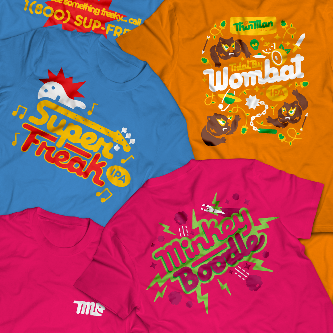
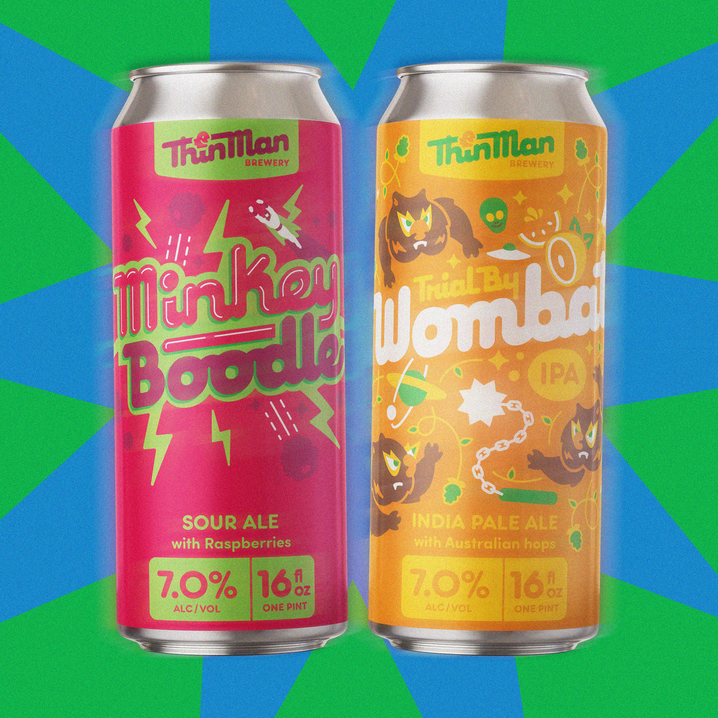
The solution was to develop a flexible brand system that could unify the lineup while still allowing each product to feel distinct.
Rather than designing one-off visuals, I focused on building a set of rules—typography, color logic, layout structure, and tone—that could be applied consistently across packaging, digital, and physical environments.
3. The Outcome
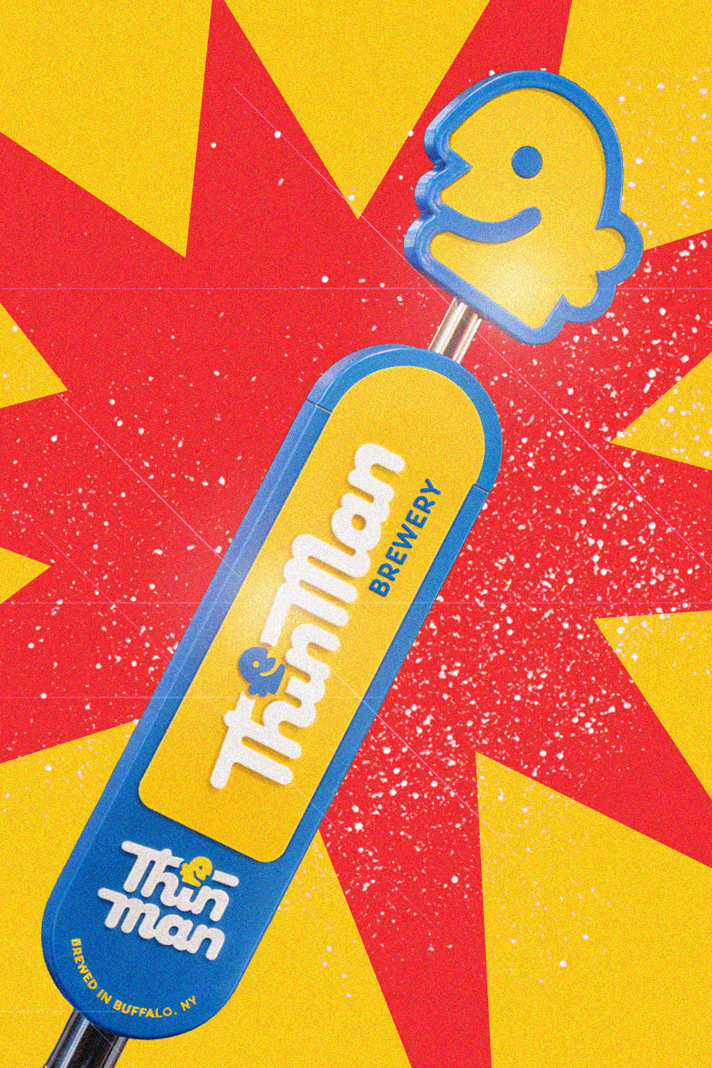
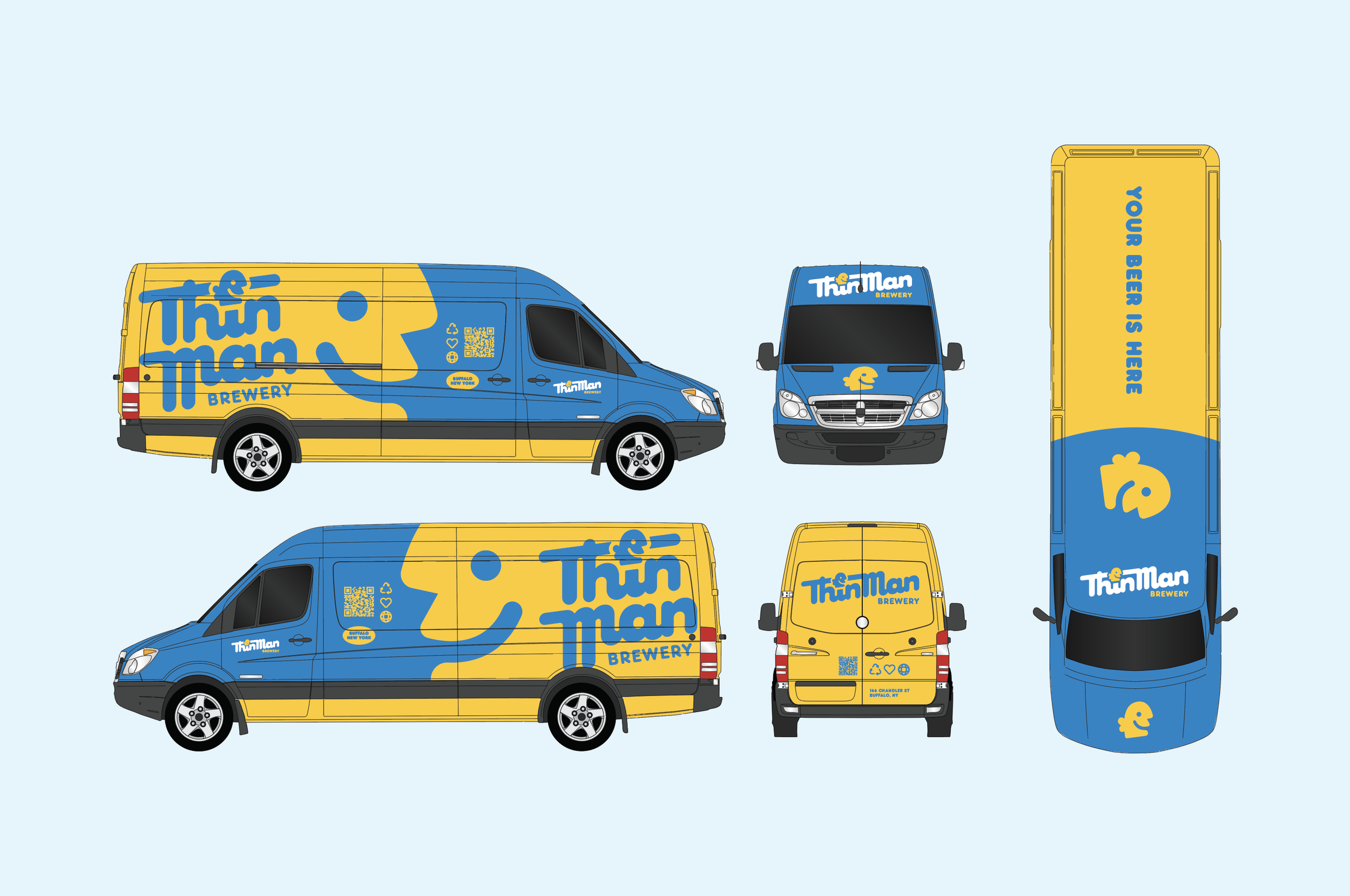
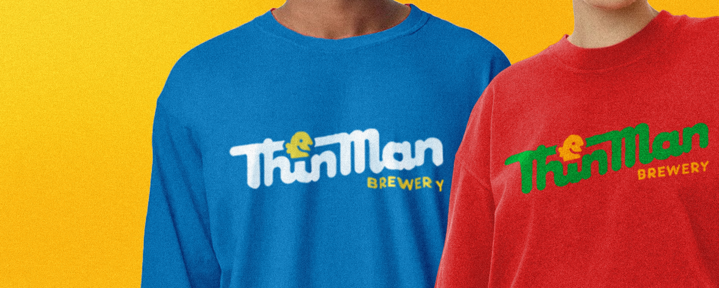
The rebrand is rolling out across packaging, digital, merchandise, and activations, strengthening shelf presence and brand recognition while creating a clear foundation for future releases.
It has also improved internal alignment and streamlined how new ideas are developed and executed, making the brand easier to maintain and evolve
Incredibly modular and rewarding.
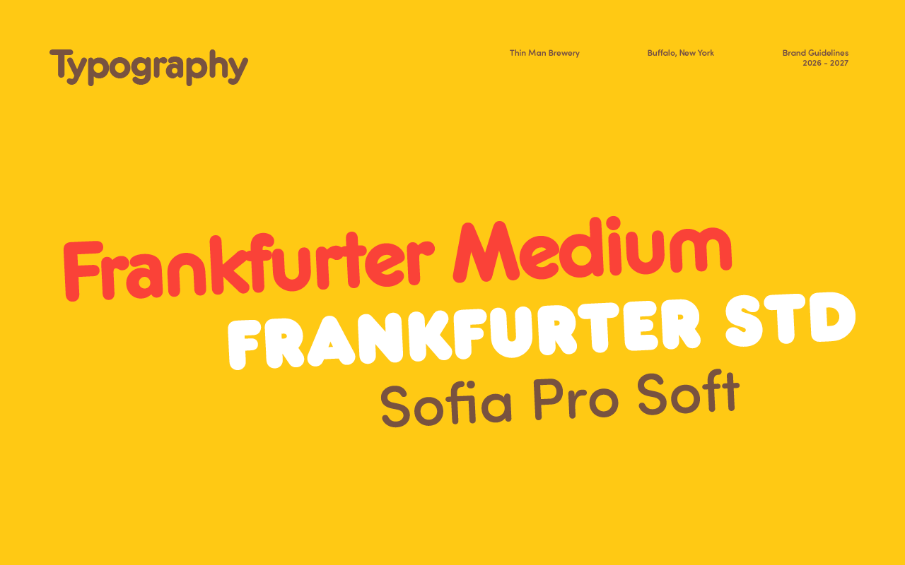
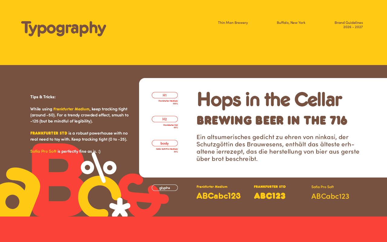
I introduced Frankfurter to Thin Man’s identity back in 2018. It was so impactful, it took over the brand. It demanded attention without taking itself too seriously.
Taking the essence of the Frankfurter family’s ultra round hi-pop charm - I made universal modular swashes and tails to cleanly link letters together and manage character weights. Slightly condensed to account for rise.
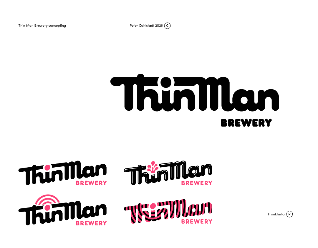
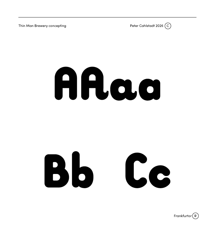
Using the dotted eye as a focal point and accessory for ornament and variation.